Team Tools Timeline
Individual Figma Feb. 2021 - April 2021
Brief
The idea for Teacher's Connect sparked during the COVID-19 pandemic and thinking about the challenges many teachers faced, especially with remote teaching. The goal behind this app is to provide teacher's a platform to communicate and support one another.
Teacher's Connect is a social media app, designed for teachers to connect as well as share resources, questions, advice, etc.
Research plan
Topic
Unprecedented challenges facing remote teaching
Background
This research study is to gain insight into how K-12 teachers find and share resources for building curriculum that is engaging for students who are learning remotely.
Goals
Learn where teachers find curriculum to teach and how they communicate with each other to exchange ideas or resources online.
Interview questions
1. What grade level and subject(s) do you teach?
2. How has remote learning impacted your teaching?
3. Do you use any specific websites to connect with other teachers?
4. Where do you go to find teaching resources for your students?
5. Describe what it’s like to find new and interesting curriculum resources that engage your students?
2. How has remote learning impacted your teaching?
3. Do you use any specific websites to connect with other teachers?
4. Where do you go to find teaching resources for your students?
5. Describe what it’s like to find new and interesting curriculum resources that engage your students?
Methodology
1:1 interview consisting of 6 participants. Each participant session was 20-30 minutes. Interviews happened over the phone and through zoom.
Participant screening
Research synthesis
Interview Notes
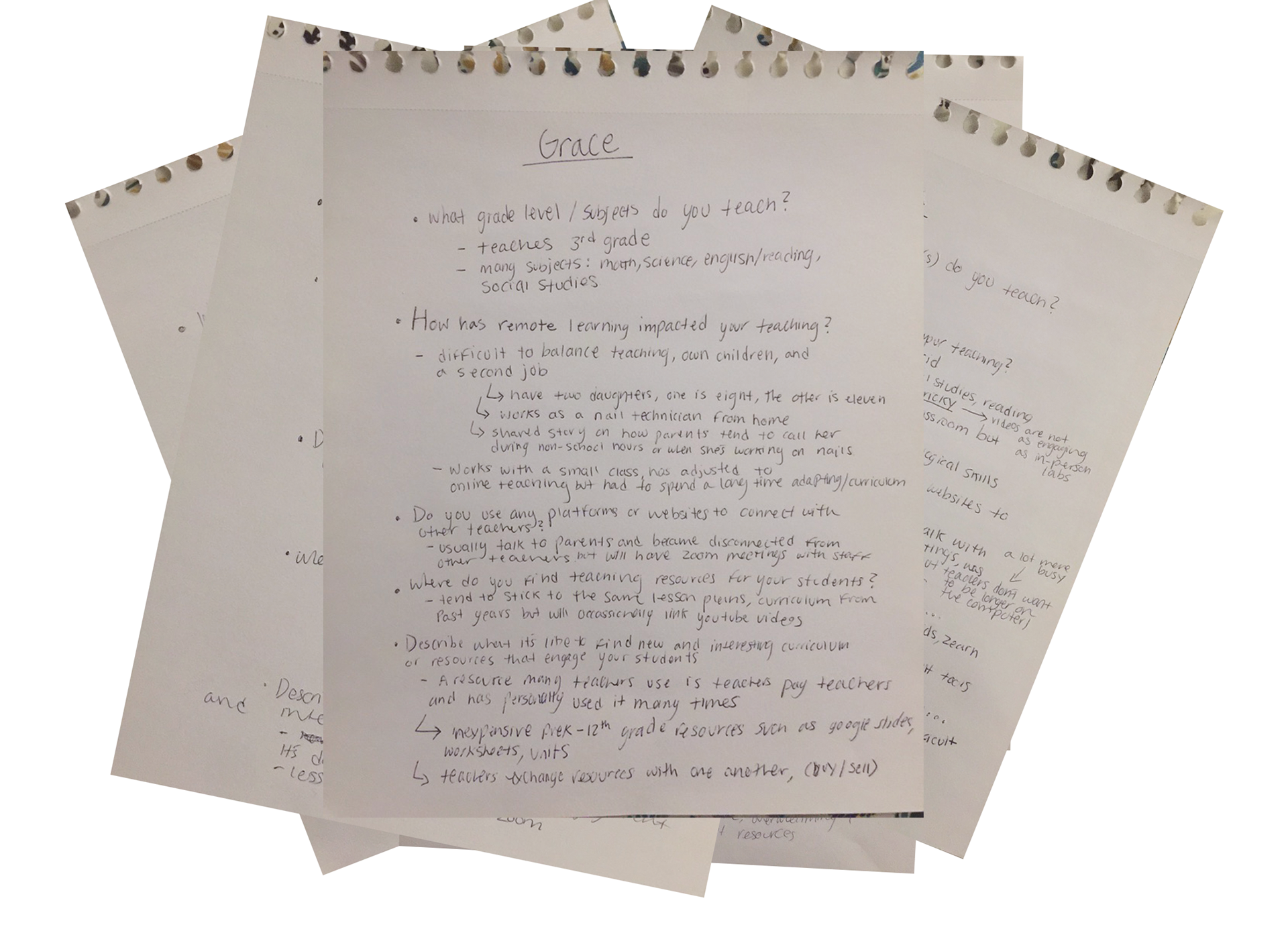
"I usually find curriculum resources through other teachers at my school, it's faster than searching online" - 7th grade English teacher
"There's so many resources online but I have trouble deciding what will work best for my class" - 5th grade teacher
"I talk to other teachers through video conferencing, there's more platforms for teacher and student communication" - 4th grade teacher
Affinity map

Insights
I created an affinity map and sorted the information from the interviews into 6 categories or themes: online resources, teacher communication, student concerns, feeling overwhelmed, class setting, and accessibility. Before the interviews, I assumed a teacher's main struggle was finding resources, but I learned that there is actually an overwhelming amount of resources and the issue is choosing.
Something that many of the teachers I interviewed said was they enjoy communicating with other teachers and exchanging resources or ideas.
I decided that I wanted to create an app that made it easier for teachers to connect.
Primary user flow
The decision to make this into a social media app was guided by the interviews I conducted. I learned that many of the platforms used by teachers are for student and teacher interaction. There didn't seem to be an online platform specifically created for teachers to communicate with each other.
The solution became a social media app because it would allow teachers to discover and talk to new people, along with their colleagues. The goal is for teachers to connect with each other, post/find resources, ask for help, and build a support system. All things which I learned teachers find valuable and have struggled with during the pandemic.
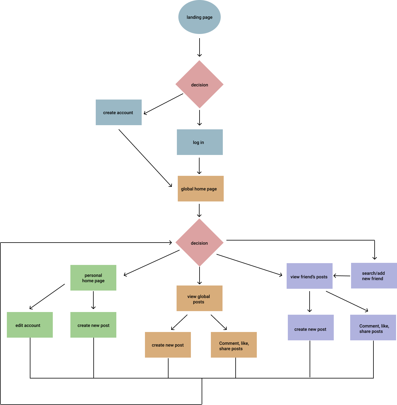
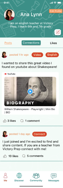
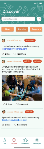
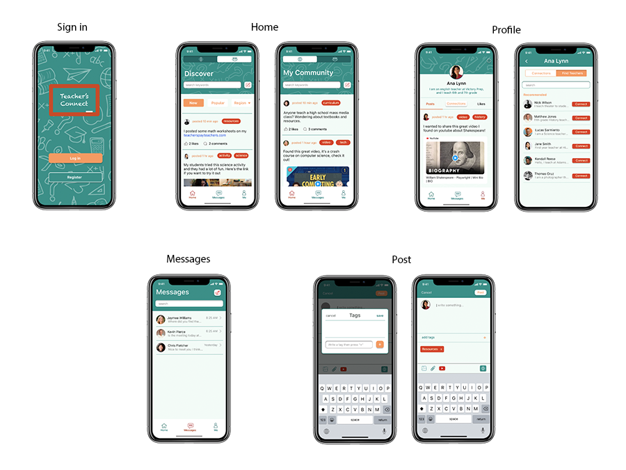
Wireframe
The wireframe showcases the user's journey within the app and the way each element will exist. The screens I designed for this wireframe include the log-in screens, which shows how you enter the app, a global feed of customized content, a personal community feed, the user's own feed, and posting content.
UX Testing
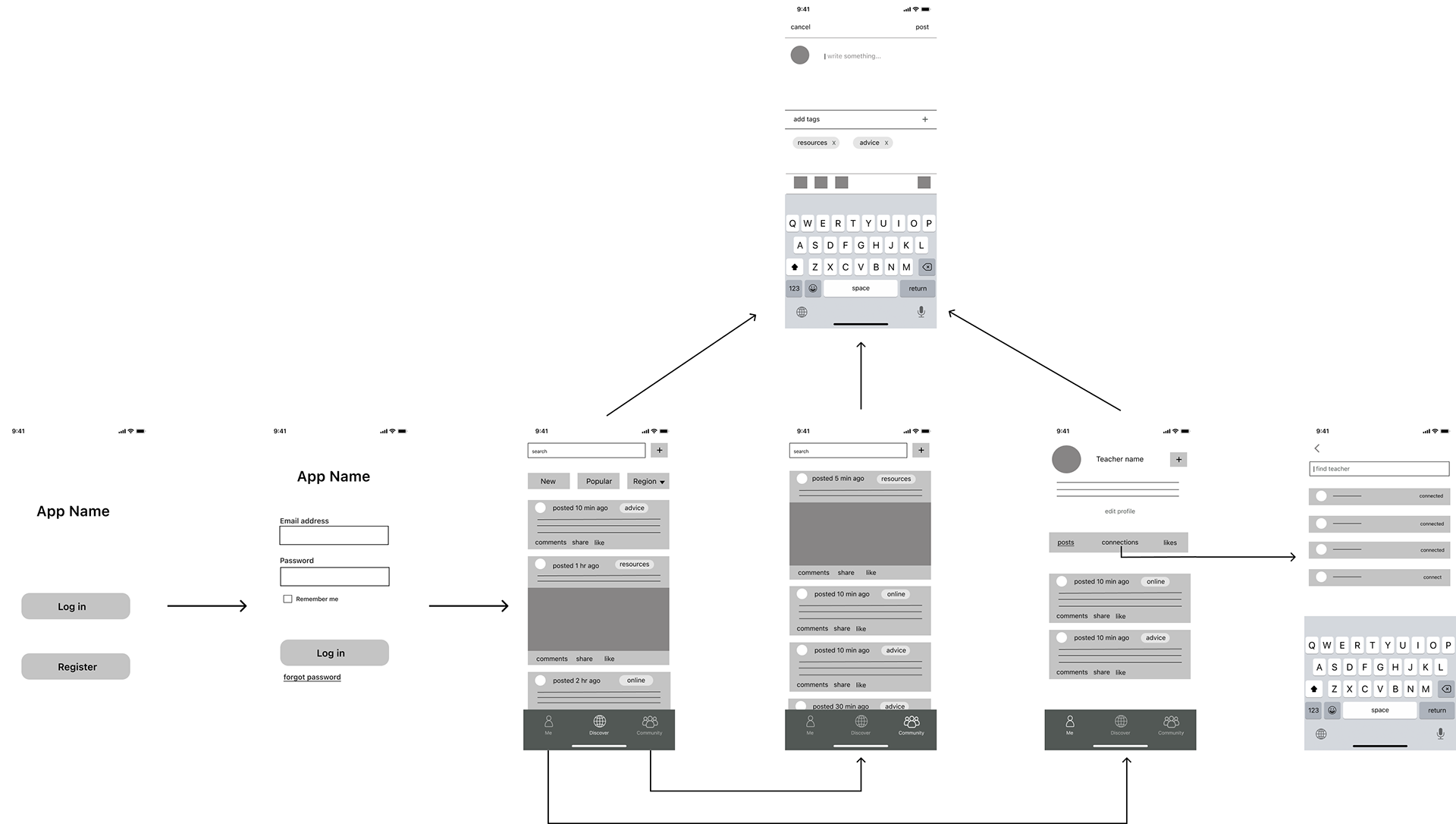
Using the wireframe as a guide, I designed the high fidelity screens that would later be used for testing. I used the feedback I received to make changes to the prototype.
UX testing outline
Purpose of test
- Receive feedback on usability of prototype
- Ask about layout, colors, icons etc
- Observe how the prototype is navigated
- Note any confusion
- Ask for recommendations for improvement
- Receive feedback on usability of prototype
- Ask about layout, colors, icons etc
- Observe how the prototype is navigated
- Note any confusion
- Ask for recommendations for improvement
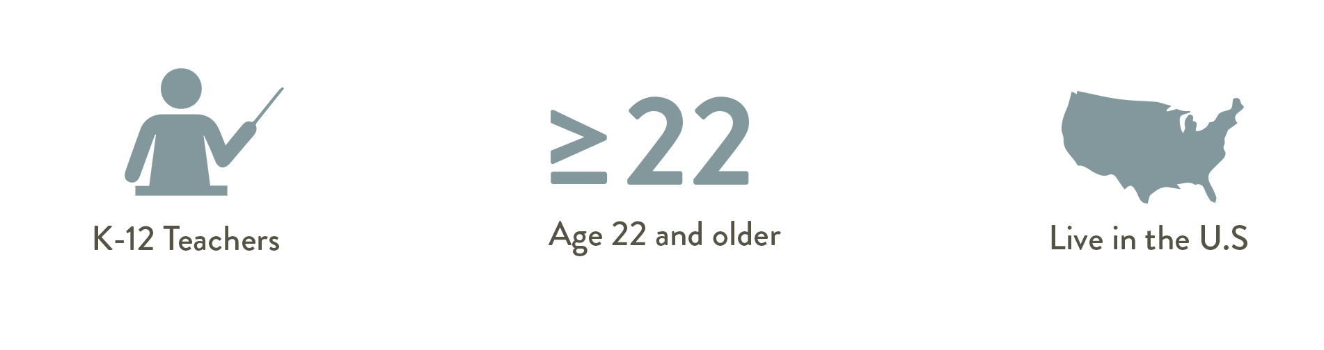
User Demographic Information
Age:
Occupation:
Gender:
Age:
Occupation:
Gender:
Questions
1. What was your overall impression of Teacher's Connect?
2. How did you find the experience of navigating between screens?
3. What do you think of the user interface (colors, buttons, layout)?
4. What is something you would change or keep the same?
Methodology
1:1 meeting on zoom, 15-20 minute session
Feedback Notes
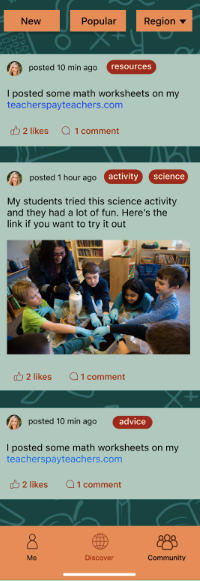
• Orange and green can be a nice combination but these colors are a little too dark,
• The "new", "popular", and "region" buttons are intuitive
• The red against the orange is hard to see
• Since this app is for connecting teachers, adding private messaging would be very helpful
• The way the colors are combined feels old school, I would prefer to see a more modern design
• The tags for the posts and buttons stand out
• Used to seeing the profile icon on the right, it's more familiar to me
• Recommend combining discover and community into one screen, it would streamline the navigation
• On the profile screen, "Posts" looks underlined rather than highlighted
• I like the color palette, it adds hierarchy by drawing your attention to certain elements
• The post icon and "edit profile" button on the user's profile seem a little out of place
• On the discover screen, try a clearly highlighted button instead of the shaded out one
Final prototype
Prototype still image
Key takeaways
I designed this app with a specific audience in mind, and although I am not a teacher, I knew that teachers faced many challenges during the pandemic. I had an audience and a problem; it wasn't until I conducted my interviews that I decided I would be creating a social media app. I learned that teacher's value collaboration/communication, and going from in-person to remote teaching was a difficult transition.
Teachers juggle many things and some days can be overwhelming. Having communication with other teachers facing similar situations and helping each other can make a great impact. That is the goal of Teacher's Connect.